“The
College Dropout” (2004)
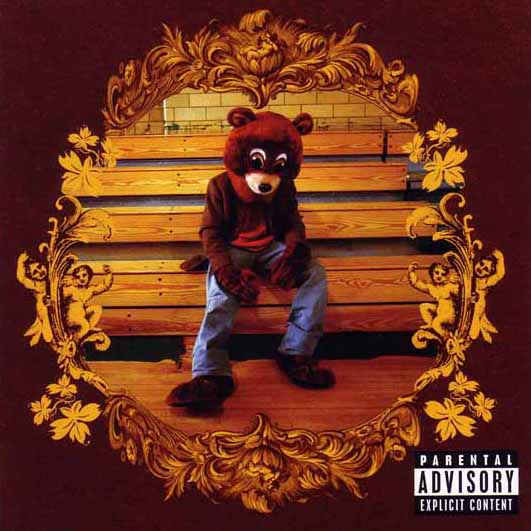
This album
is Kanye’s 2nd studio album; it shows a more humble and not yet main
stream Kanye, the bear in the centre of the cover seems dejected this costume
can be identified with the album in many ways. The name “The College Dropout” refers
to when he dropped out of the American Academy of Art in 1997 that he gained a
scholarship to after high school. The bear that he is dressed out is the mascot
of the school and it’s possible that his weary looking posture can be
attributed to his possibly conflicted feelings about leaving the school, the
gold framing can perhaps be used to represent how his time there was a
cherished memory that he looks back on fondly but also perhaps with a little regret.
Overall the
Album cover is a far cry from the image that the modern Kanye represents, the
album as a whole has a whole different feel to what he is about now.
“Watch The Throne” (2011)
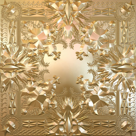
This is
Kanye’s 7th Studio album and is vastly different from what he
represented in 2004, at this point Kanye is an internationally recognised
artist, both for his music and his antics off the stage. And this album cover
represents this well. It is somewhat simplistic. The deeper meaning of it is
harder to decipher. Compared to the more nuanced album in 2004 this album has a
much more pop vibe and is less a focus on the lyrics but more on the beats. The
gold shows what his life is like now, glitz and glamour.
This album
shows the change in Kanye, from a gifted lyricist to someone who is known more
for his large ego and off stage antics. The album cover is simplistic but shows
what he is trying to represent which is his wealth and power.
Although the content is this piece is quite brief you have looked into the deeper meaning including the visual codes which is good. You could have added more opinions on how the albums have changed and what they now represent. There is a reasonable amount of context about his life however you could have included more e.g. his record company, how much money was made from this.
ReplyDeleteThe actual layout of the article is well suited as it links in the information next to the picture relating them together. You chose two very contrasting album covers and were able to see instantly a comparison however despite the fact that you were able to look deeply into the albums themselves you didn't make that much of a comparison with each other. You too lack your own personal opinion but you mention the representation of each album greatly and really well.
ReplyDelete