Rather Be
Visual Codes
The film features a lady who constantly listens to the song and begins seeing the band members everywhere. It is set in a japanese city and follows her as she goes about her day, from when she wakes up to when she goes to bed, there is strong use of colour from the produce she buys to her room itself. The same four shapes appear often throughout the video. As she begins to hallucinate the colours become muted and darker.
Technical Codes
There is a large variety of Camera shots, a lot of close ups to focus on the woman's face and long wider shots when it shows her about the city and traveling. With the close up shots of her face to show her panic as she begins to hallucinate the band members. It is also shot from her point of view, the music is upbeat and happy which is a stark contrast to the later subject matter of her hallucinating.
Birdman Poster
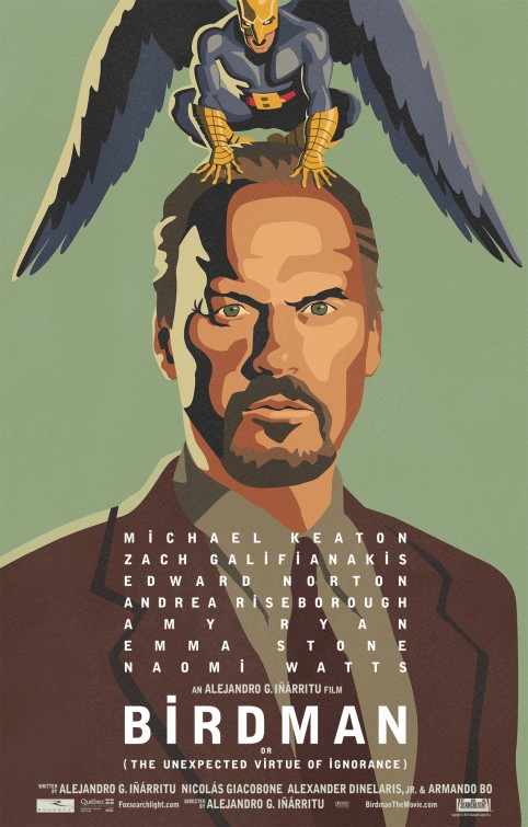
Visual Codes
The poster features Michael keaton prominently on the front cover, he has a stern expression and half his face is shrouded by shadow. The film is about his Twilight years and trying to regain his fame from when he was 'Birdman'. The poster is Plain in natures with very few shades of colour. The letters are bold and strong, this matches his stern expression. He is looking straight forward at the audience, penetrating them with his eyes. This is used to catch a passer byes attention to the poster.
Vogue

Visual Codes
The Magazine features the model prominetly on the front cover, her expression is Fairly stern as she stairs towards the camera. The colours are strong and there is a stark contrast between blues and reds. The font is bold and strong and her dress also contrasts against the background.
No comments:
Post a Comment